Have you ever questioned yourself why your business card does not appear like your site header, yet they are all the same brand colour? Or why do you change color on the screen and print out totally different? The solution here is the consistency of colors – one of the most important and least considered elements of design and branding. It is at this point that the Pantone Matching System (PMS) comes in handy. With this guide, you will not only learn how PMS functions, why it is necessary in ensuring brand integrity, how to use it, and the most frequent pitfalls to avoid when dealing with colors in various media.
What is the Pantone Matching System (PMS)?
In 1963, the printing industry was also transformed after Lawrence Herbert invented the Pantone Matching System, which revolutionized the industry by coming up with a standardized model of reproducing colors. Before PMS, printers and designers were faced with irregular color reproduction, and therefore, they had to re-print and incur brand inconsistency costs.
PMS seeks to address the basic issue of consistency in color among various media, materials, and geographical locations. You can be printing business cards in New York, or you can be packaging in Shanghai, but you are not going to find any difference in your brand colors when you do it with PMS.
PMS is based on a spot color system, in contrast to other color systems, including RGB (digital screen) color systems, CMYK (traditional four-color printing) color systems, or HEX color systems (web design). Whereas RGB colors are produced by light emission and CMYK color production is done with the use of cyan, magenta, yellow, and black inks, PMS colors are already mixed, standardized ink recipes that give repeatable, precise results.
How PMS Works
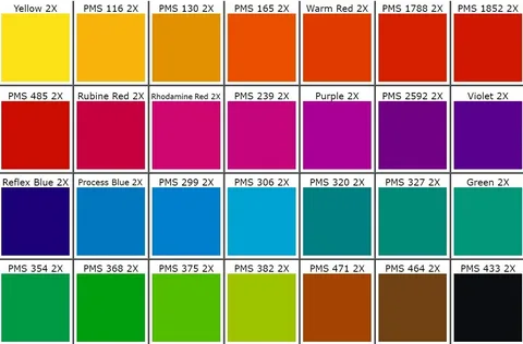
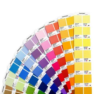
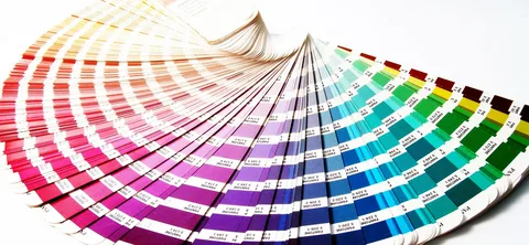
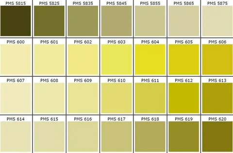
The Pantone color swatch system, which is also referred to as Pantone chips or color guides, is the basis of the Pantone system. These tangible reference aids have hundreds of carefully developed colors, and each of the colors has a number assigned to it and, in some cases, a name.
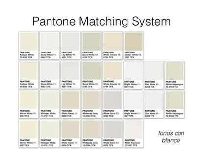
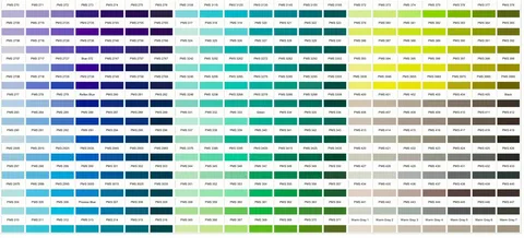
Pantone colors have a certain numbering system. To take an example, the color of red is called Pantone 186 C, which means that the color is created to be coated on paper. It may also include U (uncoated paper) or M (matte finishes). Such of numbering leaves no confusion, and every participant of a project is referring to the same color.
Printers do not utilize process color printing, but spot color printing when using the PMS colors. Spot colors are pre-construed inks that are the same formula as the Pantone one, whereas process colors are many inks mixed to make an approximation of the desired color. This difference is essential in having an accurate color reproduction.
PMS does not limit itself to printing but allows it to be extended to digital applications, but with restrictions. Although physical Pantone colors are the final source of color, digital representation assists the designer and client in seeing the colors on screens, and they know the final printed product will not match the one they view on the monitors.
Why PMS is Important for Designers and Businesses
The first PMS value to businesses is brand consistency. When it comes to customers, your logo, packaging, or marketing materials ought to be exposed to the same color, no matter the place or manner in which these media were designed. This consistency creates brand awareness and professionalism.
The variation in reproduction of colors between print and digital media poses a big challenge when the system is not standardized. The bright blue you had in your site may be a dull shade or something completely different when printed on business cards. PMS fills this gap by offering a face-to-face reference at a physical point that is not limited by medium.
PMS also allows precise matching of color over a variety of substrates. You can be printing on glossy paper, fabric, plastic, or metal. Pantone offers the formulations and recommendations to ensure that you can replicate the same results using other materials.
PMS is extremely important to international businesses because it is global-standardized. A multinational company can define Pantone colors and have similar outcomes when using local suppliers throughout the world, which will remove the confusion and uniformity that have afflicted other color specification systems.
How to Use PMS Correctly
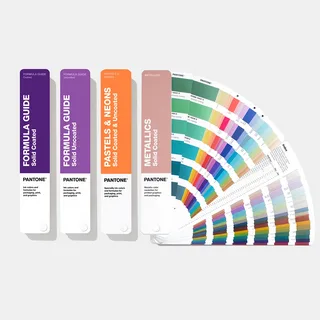
To choose the right Pantone color, the first step is to know what is needed in your project. Take into account the place and the purpose of the color – various Pantone guides apply to various purposes. The Pantone Formula Guide contains the largest number of colors to use in general print, yet there are other guides to textiles, plastics, and other materials.
The use of physical Pantone guides is important regardless of the digital competition. Those swatch books demonstrate the appearance of the colors in various situations (under diverse lighting conditions) and on various paper types. When selecting colors, look at them with regard to the lighting in situations where the color will be most frequently used.
Color space conversion of PMS colors to other color spaces should be done with caution. Although Pantone does give CMYK, RGB, and HEX equivalents to their color, they are approximations. It is always advisable that the original PMS color be used as the main reference, and any conversion should be done when it is not possible to use spot color printing.
Easy communication with printers and designers will avoid costly errors. Always include the entire Pantone code with the suffix (C, U, or M) and, where possible include physical swatches. Talk about substrate choices and surface treatments; these choices will greatly influence the end result in terms of the appearance of the color.
Common Mistakes & Misconceptions
The misconception regarding digital-to-print color matching is one of the most common ones. Computer monitors light to produce colors, whereas the light is reflected in printed materials. This is the reason behind this basic difference, as you will never get an exact screen displaying the same results as the printed results. Moreover, variables such as light conditions, type of paper, and ink intake influence the result.
The use of screen previews only causes disappointment and reprints that are expensive. Although digital color previews are generational, they cannot substitute their physical counterparts. Proofs should always be printed before large print runs are approved.
The second frequent issue is the utilization of old Pantone manuals. There are formulations of ink, which may fade or turn wrong in colour with time. According to Pantone, color guides should be changed every year when it comes to critical color matching.
The lack of color management adds to these problems. Monitors that have not been calibrated, improper ICC profiles, and poor proofing methods may present large differences in color. Calibrated equipment and a standardized workflow are necessary in professional color management.
Pantone Tips & Best Practices
It is also suggested that to keep your physical color guide in the best possible state to guarantee color referencing. Store guides should be placed out of the sunlight, clean, and handled with much care to avoid fading or damage. Think of the age of those who guide you, and change them when the colors start fading or changing.
Color proofs must always be evaluated before final production is approved. A request for proof is similar to a final job except in that it is printed on the same paper using the same process. Test swabs in the right conditions and also make direct comparisons with your Pantone guide.
PMS is not limited to printing the paper on textiles, plastics, coatings, and other materials. Pantone specialists’ manuals are available for these applications, and knowing the constraints and the capabilities of various substrates can help provide reasonable expectations.
Any production process is characterized by color variations and tolerances. Set standards of what will be tolerated before production, and realize that there will be minor deviations as a norm. Collaborate with suppliers who are also experienced and who know these tolerances, and who can work within acceptable tolerances.
Alternatives & Complementary Color Systems
Although PMS takes the lead in the color-matching industry, there are other systems that are used in certain functions. The colors of RAL are used in Europe, especially when it comes to coatings and paints. Government and military uses are made of Federal Standard 595 colors. The knowledge of when the alternatives could be more suitable will conserve time and expense.
There are occasions when PMS may not be the right tool of doing your project. CMYK process printing may also be cheaper than spot colors when it comes to using limited budgets. RGB or HEX codes may be sufficient to use in purely digital applications. Assess your needs and requirements and select the best color system.
In modern design software, the PMS colours are incorporated using digital colour libraries, and the Pantone colours are now easier to define and operate in digital processes. These tools help in bridging the gap between physical references of colour and the digital design process, but they do not negate the physical verification of colour.
Recent Trends & Innovations in PMS
Pantone has continued to innovate, and it keeps coming up with new colors to suit the market conditions. The latest publications have concentrated on colors that have been effective in digital applications and environmental printing. The introduction of the Color of the Year annually brings a lot of publicity and affects the trends of designs in any industry.
Sustainability is now a key factor in color production and matching. Pantone has come up with more environmentally friendly inks and encourages sustainable printing. This tendency is the understanding of the increasing environmental consciousness and regulations in numerous markets.
The digital tools are still changing the color-matching workflows. Applications on smartphones can determine the approximate color in Pantone, and digital color scanners are more accurate in determining color. Although such tools make the process smoother, these tools do not substitute the conventional color matching techniques but complement them.
Conclusion
The Pantone Matching System is the standard of consistency of the color across print and design applications. Offering a global standard in communicating color, PMS would allow the brand to maintain visual consistency and lower expensive printing errors and professional output with various materials and geographic locations. Be it introducing a new brand, revising those available in the market, or handling overseas suppliers, making the investment in appropriate Pantone guidelines, as well as knowledge of PMS principles, will yield returns in terms of professional looks and brand uniformity. You should find some time to review the processes you are using to manage colors, think about upgrading your Pantone manuals, and offer this information to your design and print partners to deliver the best possible results.