The vape packaging design arguments stick to the topic of aesthetics as to whether a particular design is considered cool or modern, as opposed to performance in stores, compliance inspections, or logistics. As a matter of fact, the efficacy of minimalism versus bold vape packaging design is much more relative to context, structural discipline and production consistency than to aesthetics.
Numerous brands have continued to believe that bold packaging will always catch the eye quicker, and minimalistic vape packaging would silently do better when performed with accuracy and production rigor. It is a bit more complex the reality: the efficiency of the design of minimalist and bold vape packaging is determined by the extent to which the design meaning is appropriated to the structure, clarity of compliance, and consistency of manufacturing.
Minimalist and bold vape packaging style is not an opposing trend but a strategic tool that works differently in various contexts, structure and manufacturing implementation in the market.
Defining Minimalist and Bold Vape Packaging Design Approaches
Neither minimalist vaping packaging design nor vivid one are necessarily superior, both are useful tools with their matching strategies of brand objectives and retail facts.
Restrained, the design of minimalist vape packaging focuses on a few colors (neutral or single color scheme), clean lines, extensive white space, and a lightweight typography. The emphasis remains on top-end finishes, such as matte lamination or finely cut foil stamping in order to deliver sophistication without being distracting.
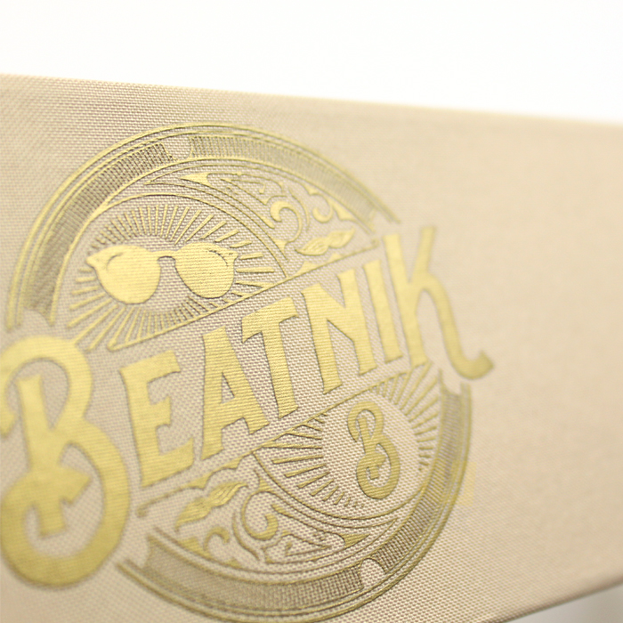
Contrast, on the other hand, Bold vape packaging design is based on high contrast, rich/vibrant colors, illustrative graphics, and dynamic layouts. It incorporates high visual hierarchy to impose instant effect, commonly, by the use of large color block, illustration or layered effects.
The two are both valid approaches although the style alone is not enough to make them successful. Here’s a quick comparison:

| Design Approach | Key Characteristics |
| Minimalist | Clean layout, limited colors, restrained graphics |
| Bold | High contrast, strong colors, expressive visuals |
How Retail Environment Influences Design Effectiveness
Retail setting pre-determines the strategy of the vape packaging design that produces the most visibility and the conversion- personal taste is the factor that rarely comes into play.
Shoppers are close (2-4feet) in upscale boutiques or specialty vape shops and window shop. In this case, minimalism in vape package designs tends to work better due to the fact that subtle details such as texture or specific embossing add to the perceived quality without making a visual conflict.
The crowded chain display or the convenience store high-density environment requires a 6-10 feet instant recognition revealing dozens of similar SKUs. Unconventional vape packaging design is often triumphant in this competition with the contrast and color burst that combats display jumble.
The addition of controlled markets through strict rules of placement and a necessary warning goes another step: the designs that preserve clarity at a distance are favored. Mixed-SKU shelves are incentives to organized daring that balances impression with readability.
| Retail Context | Design Approach That Often Performs Better |
| Premium boutique | Minimalist |
| High-density retail | Bold |
| Regulated markets | Minimalist with clarity |
| Mixed-SKU displays | Structured boldness |
The choice of the channel strategy must be led by channel strategy rather than design trends.
Compliance and Readability Considerations in Design Choices
Compliance is not just a courtesy, but usually the difference between a design that passes when it comes to regulatory compliance, and one that achieves success on shelf.
They should have mandatory warnings (nicotine content, health risks, age restrictions) which should be visible, readable and not covered by any other object according to the FDA and state regulations. Minimalist designs generally have a more efficient influence on clarity of compliance since the spaces and modest design emphasis do not bury warnings in the designs or as nauseating.
Risky designs are bolder: intensive graphics or too much pattern, even too vivid can lessen the readability of required text, particularly in small font sizes or at a glance. Warnings design Over-design Over-designing around warnings can often be very expensive to revise, or sometimes will be rejected artwork.
Brands that prioritize professionally manufactured vape packaging can see that early as structural engineering and print proofs can identify readability problems during production.

Structural and Manufacturing Implications of Design Decisions
The ambition of design is satisfied in the manufacturing whereby a concept is assessed to be premium or problematic based on tolerance.
Slim vape packaging is a reckless way to reveal the imperfection: any combining, color difference, and surface flaw is seen against the background of smooth surfaces and classic typography. It requires heavy registration, steady pressure on finishes such as soft-touch lamination and imperfect material.
The bold vape packaging design must be equally disciplined in other aspects: huge color blocks must be carefully controlled in form of ink density so that they do not mottle and high-contrast edges must be die-cut and aligned so that they do not bleed or be ghosted.
Both styles are affected by structural problems such as box deformation during storage or construction, but minimalist designs are more clearly displayed as warped or creased.
| Design Factor | Manufacturing Implication |
| Large color blocks | Color consistency control |
| Fine typography | Print accuracy |
| Embossed elements | Pressure precision |
| Matte surfaces | Defect visibility |
To achieve the variable consistency in results, a competent vape packaging manufacturer manages these variables internally to produce the same output across the run.
Shelf Visibility vs Brand Longevity
- Bold vape packaging design – exaggerated contrast and scale are good in capturing attention in places with a lot of people in a short period of time.
- The minimalist vape packaging is more consistent with long-term brand awareness and loyalty: clean and classic design would naturally age without overly catchy and loud graphics that may get too repetitive across seasons.
- Unfussy pieces are at risk of being outmoded sooner in case the tastes at the market change or are overused within a category that already has a lot of high-impact items.
- Minimalist designs develop the sense of premium quality as the time goes by particularly when combined with quality tactile finishes which promote repetitive handling.
Common Mistakes Brands Make When Choosing a Design Direction
- Choosing an orientation strictly on the current trends rather than studying details of the target retail medium and consumer behavior.
- Ignoring manufacturing constraints at the concept stage, with resultant designs that appear fantastic on the computer but fail in the repetitive manufacturability.
- Separating design and compliance into silos, so that at late stages, it becomes necessary to rework when warnings cannot fit nicely together.
- This is a bad practice of letting different SKUs be inconsistently executed, either due to different tolerances or finishes leading to a brand dilution and confusing the shelf display.
Conclusion — Design Works Best When Grounded in Manufacturing Reality
One of the styles, either a minimalist one or bold, will not triumph in all the vape packaging design tactics. In alignment comes success: the approach to particular retail circumstances has to be matched, the compliance clarity has not to be provided, all decisions have to be based on the realistic manufacturing capability.When the intent of the design and the execution capability align, the minimalistic as well as the bold vape packaging design can be able to produce a high performance. The successful brands do not consider packaging as an ornament, but as an extensively systematic matter whereby, structure, print accuracy, and regulatory adaptation bring about the real world outcomes, not brief-term appeals or the individual taste.