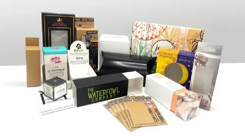
Your brand is a silent salesperson that is also a protective guardian, but most of all, your first impression is in one simple container called plastic packaging. However, countless products arrive on shelves with bad packaging designs that include too much stuff and are so ill-planned that they chase away customers. The problem with these design failures is that they not only disappoint the customers but also discredit it and prove costly to its sales.
At Crown Win Packaging, we know how innovation can make products well-designed, making them must-haves. However, we have also seen how even grown-up companies pay for their mistakes at a great cost. What are the most widespread packaging design traps, including the most heinous examples, and how can they be so harmful to the business achievements? And how can they be so harmful to the business achievements?
1. Hidden or Misleading Contents

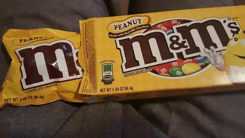
There is nothing that irritates consumers as much as taking a package with excessive packaging and realizing that there is much less stuff than one anticipated seeing. It is the practice of packaging design where the juice pack shows a generous and full amount, whereas the real content held in it is less impressive.
This is especially predominant in snack foods and frozen meals, often marketed for all the wrong reasons. When you take a cereal box made of material, you would see a bowl full of the cereal product spilling over fake packaging, but in real life, it would not even occupy half of the box. In the same way, frozen dinner products tend to portray mouth-watering foods that have little physical similarity to the meager serving.

It is far more than having a failed one-time purchase because the damage can be money lost. When customers develop the perception that they have been cheated, they will no longer trust the brand. These bad experiences are passed on in a very fast manner through the dynamics of modern social media, and they would reach a number of thousands of customers who would be interested in the goods or services being offered. Innovation in design and development of packaging technology is what makes intelligent packaging build trust in the long term and not in the short-term gimmicks.
2. Overcomplicated Packaging

You know the feeling when a set of instructions designed by a professional designer makes the appearance of tough Nazi guards a welcome addition. Unnecessary complex packaging tools cause unneeded tensions between the customers and the products, undermining functionality and turning what could be a pleasant unboxing into a sour idea.
Consider the clamshell packages that escaped the Minotaurian clan and which require industrial-strength scissors or products that are sold in layers of plastic, twist ties, and tape. Besides the fact that such beverage packaging plastic designs frustrate consumers, including bottle design, they also lead to high waste due to outdated technology to which environmentally conscious consumers are growing against.
It will be solved by an intuitive design, which is focused on user experience. The good packaging ought not to be hard to open or close, and also not hard to use efficiently, highlighting the importance of ease of use. The easier it is to find your product, the more customers will tend to use your product again or refer the product to their acquaintances.
3. Poor Typography & Illegible Text
Typography: This may sound like a small detail; however, even the finest of packaging can become useless in the presence of illegible text. A package fails to fulfill its main purpose of communication, often due to poor graphic design, when the label text is not readable to consumers in case they are in need to read information on products, ingredients, or instructions on their use.
Other typography errors would be the use of ornamental fonts at the expense of legibility and readability, the font type may be set too tiny to be read easily by the average consumer, and font color may be chosen without adequate contrast. The older consumers and the visually impaired are especially vulnerable to these types of problems, thus cutting off a huge percentage of your potential market for two products.

Clarity is the most important process in professional packaging design. Information pertinent to normal retail lighting must be read instantly at near-norm retail lighting. Bear in mind, after proper testing, customers do not find it comfortable to buy a product when they do not understand its shape or line of technical information.
4. Misleading Product Imagery
The most important question of proper package design is the use of visual representation, and in case the visual representation deceives the viewer in details of the actual product and creates a dangerous distortion of expectation and reality along the line, then it is an issue. This is not just the difference in size as such but the quality of the colour, the manner in which it contributes to the texture, and a depiction of quantity.
A fast food package always falls into such a trap because what you see is not the actual food, but what looks like the burgers. Consumer goods are the same; fruits are not an exception either; radiator coolant products that are shown in unrealistic light or other household items that are illustrated as larger than life are usually the result of poor packaging designs, which do not meet the expectations and are examples of poor branding, which spoil the image of customers.
Real photography creates a better rapport with the consumers. Although creative presentation tools are still significant, their aim should be to make the product more attractive and desirable instead of giving misleading impressions. that only aggravates to ultimate dissatisfaction and returns.
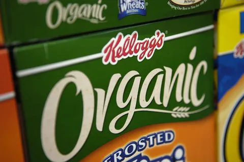
5. Confusing Branding

Within the unfortunate conditions of the retailing rush, a transparent brand introduction is required to generate consumer recognition and loyalty in the form of a designed container that can be used to visualize brand values. When positioning logos is not done in an eminent way and when the brand names are encased by busy designers, the products develop to generic names rather than brand names.
This is generally because of the confusion, trying to put too much information in too little space, which includes hierarchy at its worst where there is nothing that was actually prominent. The brand conceals the brand name in microprint and concentrates on less important details of the design, which makes the item a customer desires difficult to locate.
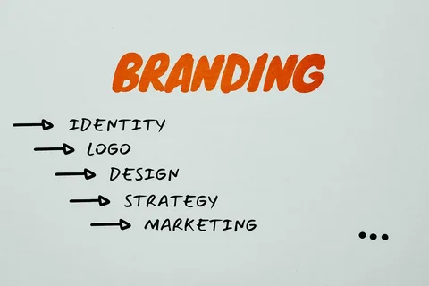
Placement of a brand strategically guarantees instant recognition as it complements on overall marketing. All your packaging, including the bag, ought to act as a billboard of your brand, such that the customers who are happy with your services can locate you and purchase your products easily.
6. Inappropriate Graphics

With strong subconscious content, visual design comes with significant messages that could send the wrong messages to the brand when graphic design is poorly done. Such errors include graphics that unintentionally allude to controversial cultural or political themes, as well as pictures that unintentionally have the look of something inappropriate.

Social media intensifies these design failures by rendering packaging failures viral, which is more than sufficient to cancel out many years of brand building. Even the most innocent design choices that people have paid money for can come back to haunt us when looked at through the prism of other cultures or when it is decontextualised.
Review processes enable one to evaluate the risks before launching the products in the market. These errors that the brands will never forgive will be absent in the experiment of the various focus groups, the various cultural backgrounds, and the application of the innovation.
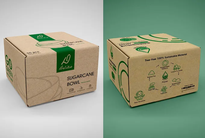
7. Clashing Color Choices
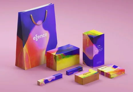
Psychology of color plays a key role in the development of consumer perception (particularly, their appetite, perceived quality of the product, etc.). The colors that are used in packaging can create incongruent messages that are repelled by a potential customer when the color does not match the nature of the product, such as fruits, or create an aesthetic incompatibility.
And all one has to do is look at health foods that are organically made, yet are being packaged in unnatural neon colors, or high-end articles that are being coated with low-end color schemes. Using these loopholes puts the consumers in a state of cognitive dissonance, which challenges the excellence of the products and their brand positioning.
Powerful color strategies are both product-oriented and demographic-oriented. The colours need to be efficient to read and convey brand values, coupled with creating emotional connections that will enhance purchasing. The choice of colors is a professional activity that concerns the relationship of colors under various lighting circumstances and the reproduction of colors concerning various printing systems.
8. Poor Structural Design
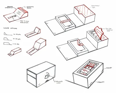
On top of being an aesthetic item, the packaging, including the bag, must also have the fundamental purpose of protection. The inability to deliver the goods in the appropriate container structural design leads to spoiled goods, which provide the user with immediate negative experiences that reflect low quality in delivering the brand and substandard customer services.
Common structural defects include low cushioning support of fragile items, poor adhesives that lead to packages dropping off during shipping, and poor seals that lead to spillage of goods or their contamination. These problems extend beyond untimely packaging and, in most cases, additional waste is generated, to add to it; some safety problems may have occurred in addition to the cost of cleanup.
Quality structural design requires the know-how of the entire supply chain between manufacturing and consumer use. Excellent packaging, particularly new packaging designs, will protect merchandise during shipping, inventory, and processing in a way that is cost-effective and that may support the environment.
9. Unclear Usage Instructions
Packaging has not fulfilled one of its key roles, communication, when it cannot tell the consumers how to use, prepare, or assemble the product. The scourge of this issue is particularly on the global items, complex products, and food presentation specifications.
The instructions will be poor, leading to poor use of products, wastage, and consequently, safety problems. Aggressed customers would project the frustrating experience on products rather than packaging to leave negative reviews and not repurchase. In other cases, the liability of manufacturers may accrue as a consequence of poor instruction.
Good design teaching should incorporate clear pictures, fewer words, and a step-by-step procedure and reasoning, and should be easy to use. Testing the instructions with actual users would show where the designers were not as clear. One should remember that things that seem obvious to the product producers may seem completely unclear to the users, those who have never used the product, and that is why they develop a poor concept of the product’s usability.
10. Disregard for Accessibility: Excessive Packaging
These design alterations that apply the concepts of inclusive design ensure that the package will be usable by consumers with any ability. In this manner, ignoring the problem of accessibility, the brands will avoid the image of the packages that will exclude a large portion of the market, to say the least, possibly, even break the law in certain jurisdictions.
Accessibility oversights that are most frequently encountered include child-resistant caps that cannot be opened by elderly consumers, text that is inconveniently too small to be read by consumers with visual impairments, and mechanisms of the opening device that cannot be operated with small motor hand movements when many consumers lack such hand movements. Otherwise, these design choices, unless properly tested, not only make the use of products inconvenient, but also could deprive people of important products.
The universal principles employ a packaging that is more effective for all. The ease with which the box elements can be grasped, the high contrast text, or the ease with which the user can open the box are all designed to assist all users, but are specifically aimed at the needs of people with accessibility issues. The plan expands the geographical coverage of the market, simultaneously with the presentation of an innovative social responsibility.
11. Ignoring Shelf Impact
Retail settings are areas with a high level of competition in getting consumer attention. The packaging that cannot be outstanding or send any message in regard to the value proposition just gets lost in the midst of the hundreds of products that are in the market, whether the products are good or not.
This issue can probably be linked to perceiving packaging in an individual and not a retail context. A color that can lend a stylish appearance in design studios may be lost in fluorescent store lighting. Text that may appear to be clearly readable on computer monitors may be too small to be read at customary shopping distances.
Making a shelf impact a successful one, can only be done when the particular retail environments and consumer shopping behaviours are understood. It should also attract visual interest at a glance, accompanied by being clear regarding core benefits and points of differentiation. In real shopping mockups, rather than in studio models, testing designs identifies problems that are not recognized in the studio.
12. Offensive or Tone-Deaf Messaging: All the wrong reasons
The messages that we can bundle in our global market, which binds different people with different cultural sensitivities and social awareness, can be communicated to different people. What one company considers intelligent or exclusive may offend or otherwise appear tone deaf to another company. When compared to other products being produced in the improper context, it can lead to consumer/brand boycotts and/or other negative publicity.
These mistakes are normally occasioned by a lack of proper cultural research or neglect to take into consideration alternative possibilities of interpretation of messages by the various demographic groups in the task of packaging design. With social media, these organizational errors are more dramatic; a local package choice is turned into a global brand fiasco.
Good messaging has to be responsible to target audiences, bearing in mind implications to the wider society. Both the intercultural direct checking and the professional appraisal must be direct. Confidence, inclusivity, respect, and without edgy jokes will be needed to unlock more markets without degrading the brand.
Conclusion
Good packaging design is a challenging concept to balance, because it entails establishing priorities, which involve a trade-off of many other typically competing requirements, including aesthetic slope, functional efficiency, cost effectiveness, the materials the package is made of, and knowledge of customer psychology. The above errors are also some common stuff that even the most experienced brand does when it loses focus on the user-centered design.
We know at Crown Win Packaging that successful packaging goes beyond just preventing the disasters that we mentioned above to an even better brand value and consumer experience. Within our general philosophy, we have the use of creative writing that is innovative and examines everything about the packaging design, especially at the subconscious level, and the rest of the design process, nullifying bad packaging designs beginning with an initial idea all the way through to the retail marketplace.
The professional investment made in the design of the packaging simply does not sleep, empty, because the result is the increase in sales, an enhanced brand image, and more loyal customers. With the current competitive business world, packaging is no longer a necessary cost, but rather a competitive advantage that can and is likely to elevate good products to the top of the markets, which makes more sense.