Custom Hang Tags vs Labels: A Complete Brand Comparison Guide
custom hang tags vs labels comparison
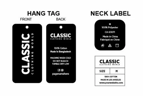
When it comes to deciding between custom hang tags and labels, it is necessary to strike the right balance of several factors, such as the product type, brand positioning, information requirements, budget, and customer experience objectives. The Hang tags are better for marketing purposes and have greater flexibility in design, but are costly, whereas labels are cheaper in terms of delivering information and integrating smoothly with the product. The most effective strategy typically is a combination of the two elements on a strategic basis, employing both of them where they will be of maximum value. The key to success lies in learning your unique needs and choosing some solutions that fully reflect your brand and address the reality of running a business and satisfying customers.